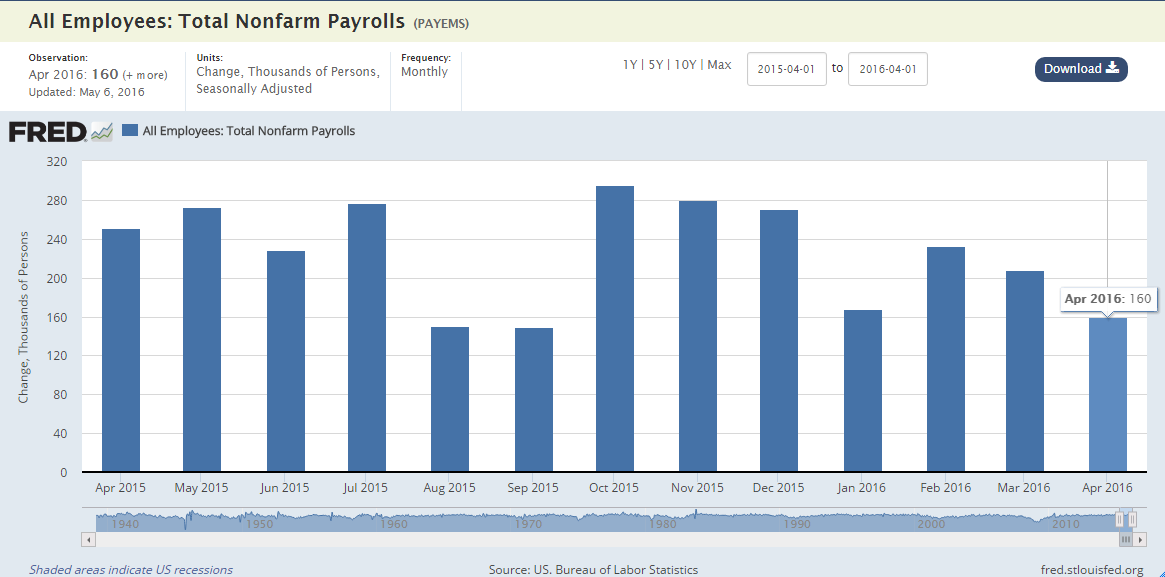
FRED will launch a new design at the beginning of June and we want your feedback now! The new site is here—with bigger graphs, refined menus, and updating metadata above the graph.
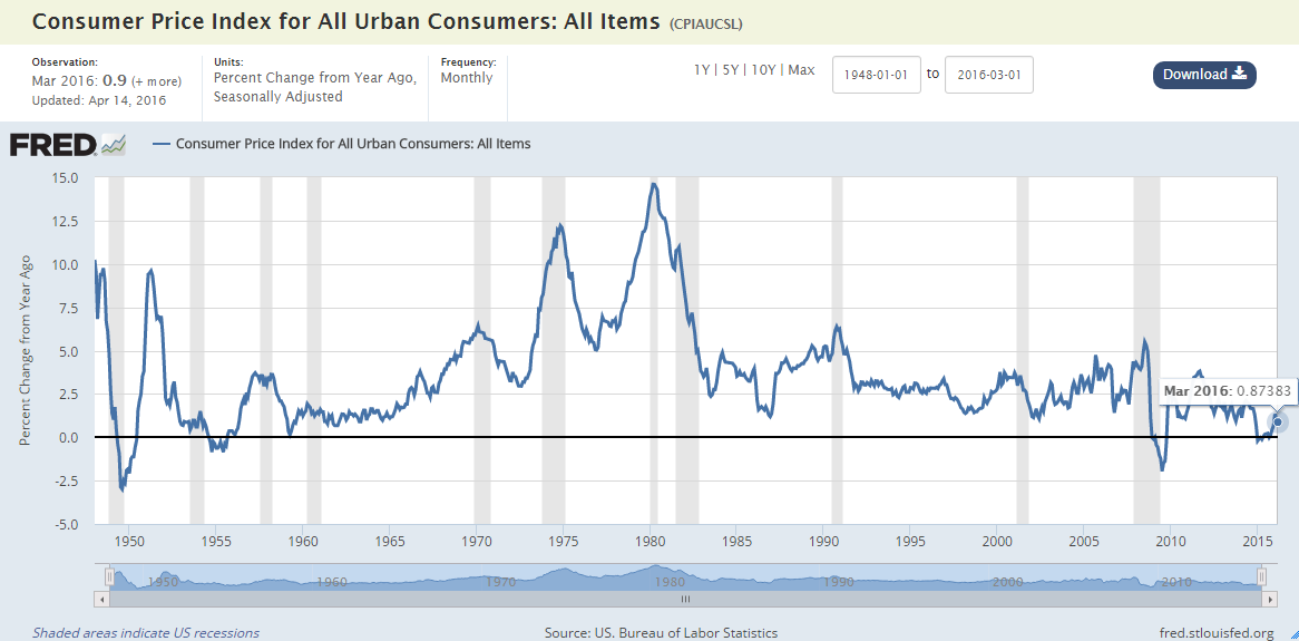
See this graph of CPI: We changed the units to percent change from a year ago. The rate of inflation appears in the metadata above the graph and point by point when you hover over the graph.
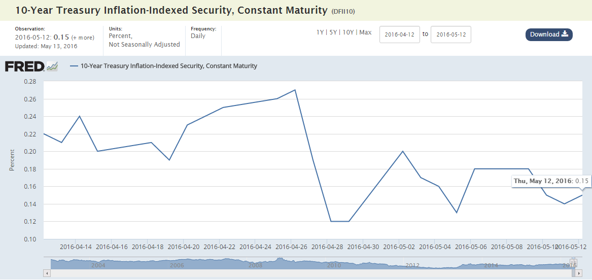
You can also easily create graphs that update: The observation range of this graph always updates to show the last month of daily 10-year TIPS.
Please check out the site and let us know what you think. As always, thanks for using FRED.


