Do you have 10 minutes? If so, you can master 10 FRED tools. This set of lessons is based on an Econ Lowdown activity found here. Let’s get started.
1. Find Real GDP (Series ID: GDPC1)
Real GDP is the total market value of all final goods and services produced in an economy in a given year calculated by using a base year’s price for goods and services. The U.S. Bureau of Economic Analysis (BEA) reports this key indicator every three months.
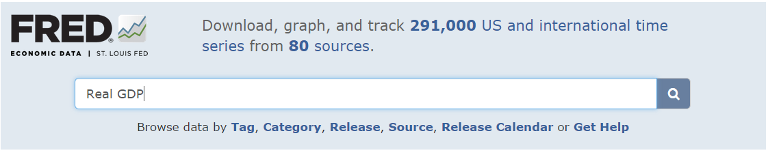
- Navigate to the FRED website: http://research.stlouisfed.org/fred2/. Or just search the Internet for FRED. Select the link that says “Federal Reserve Economic Data – FRED – St. Louis Fed.” It will probably be the first link on the list.
- In the search bar at the top of the FRED home page, type “real GDP” and press “Enter” or click the magnifying glass icon.
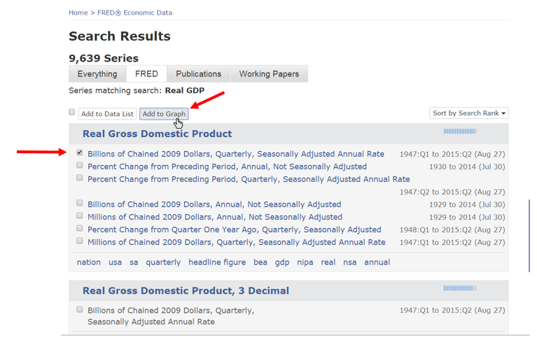
A page of search results will appear.
- Check the box next to “Billions of Chained 2009 Dollars, Quarterly, Seasonally Adjusted Annual Rate” and then click “Add to Graph.”
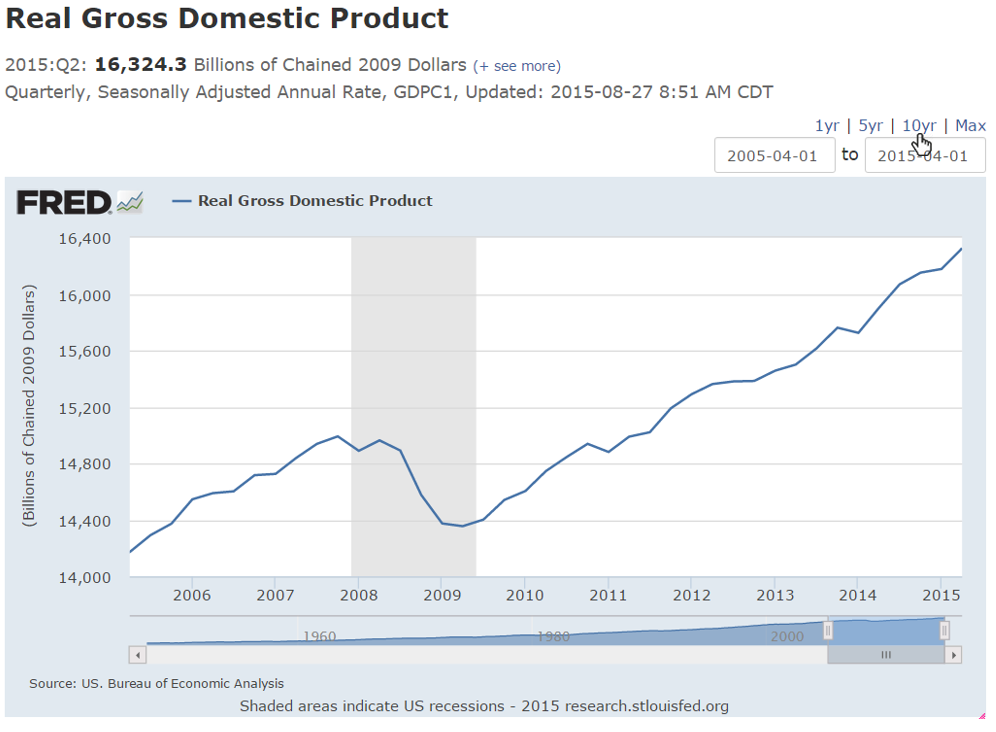
FRED automatically creates an up-to-date line graph of U.S. real GDP measured in billions of 2009 dollars.
2. Shorten the Graph Date Range by Clicking the “10yr” Setting
Notice that FRED created a graph of real GDP with dates ranging from 1947 through the latest reported data. The beginning and ending dates of the observation period are noted in the boxes on the top right of the graph. You can customize the graph’s date range with a variety of tools. Let’s use the simplest tool to narrow the real GDP graph to the past 10 years of data.
- Click the “10 yr” tab at the top right of the graph. FRED updates the graph automatically, displaying the past decade’s data. The beginning date window updates, too, confirming the new date range.
3. Mouse Over Any Point on the Line to View Values
By default, FRED’s Tooltip feature is active. Move the mouse cursor along the plot line on the graph and each value along the line will show in a box. Try it below.
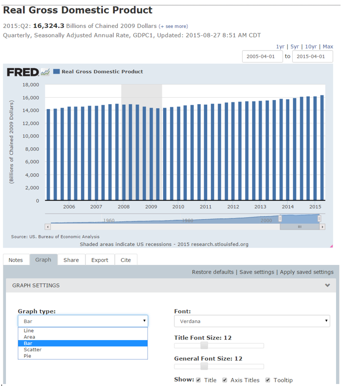
4. Convert the Graph from a Line Graph to a Bar Graph
With FRED, line graphs are just the beginning.
In the “Graph” tab, under “GRAPH SETTINGS,” click the drop-down menu under “Graph type.” Select “Bar” from the list. The data automatically convert to a bar graph.
5. Transform the Graph Frequency from Quarterly to Annual
Quarterly real GDP growth rates are informative, but what if your real interest is the annual growth rate? You can easily change the frequency shown.
- Under the “Graph” tab, Click “EDIT DATA SERIES 1: REAL GROSS DOMESTIC PRODUCT.”
- Click the “Frequency” drop-down menu and select “Annual.”
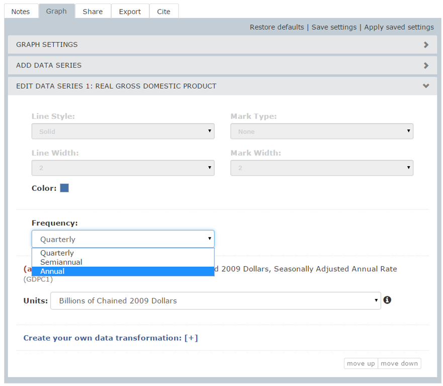
FRED automatically aggregates quarterly data values, averaging them into annual values.
6. Change the Units from Billions of 2005 Dollars to a Compounded Annual Rate of Change
Up to this point, the GDP data displayed by FRED have consisted of real values reported in billions of chained 2005 dollars. Using a measure of dollars from a base year allows year-to-year comparison without distortions resulting from changes in the overall price level (inflation). More commonly, however, real GDP is reported in terms of the annual percentage growth rate rather than inflation-adjusted dollars. FRED makes this data transformation easy, too.
- In the “Graph” tab, in the “EDIT DATA SERIES 1: REAL GROSS DOMESTIC PRODUCT” section (as in number 5), click the “Units” drop-down menu and select “Compounded Annual Rate of Change.”
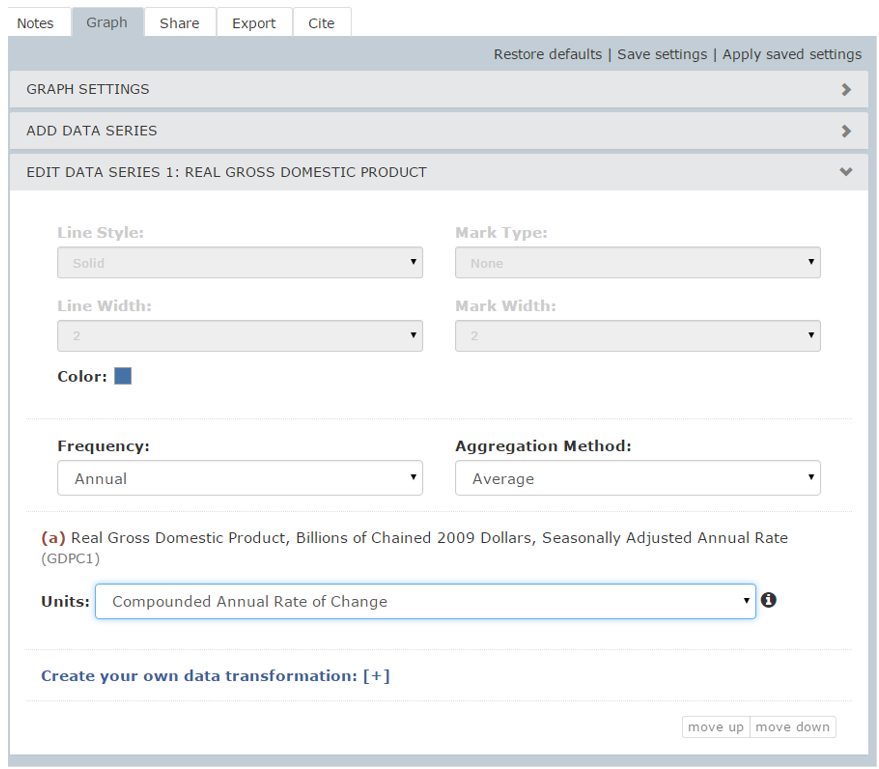
The newly transformed graph now displays GDP’s compounded annual growth rate, adjusted for inflation.
7. Change the Graph Color
This next activity is more cosmetic than macroeconomic. FRED allows you to customize the color of the graphed element.
- In the “Graph” tab, in the “EDIT DATA SERIES 1: REAL GROSS DOMESTIC PRODUCT” section (as in number 6), click the blue square next to “Color” and select any of the colors shown.
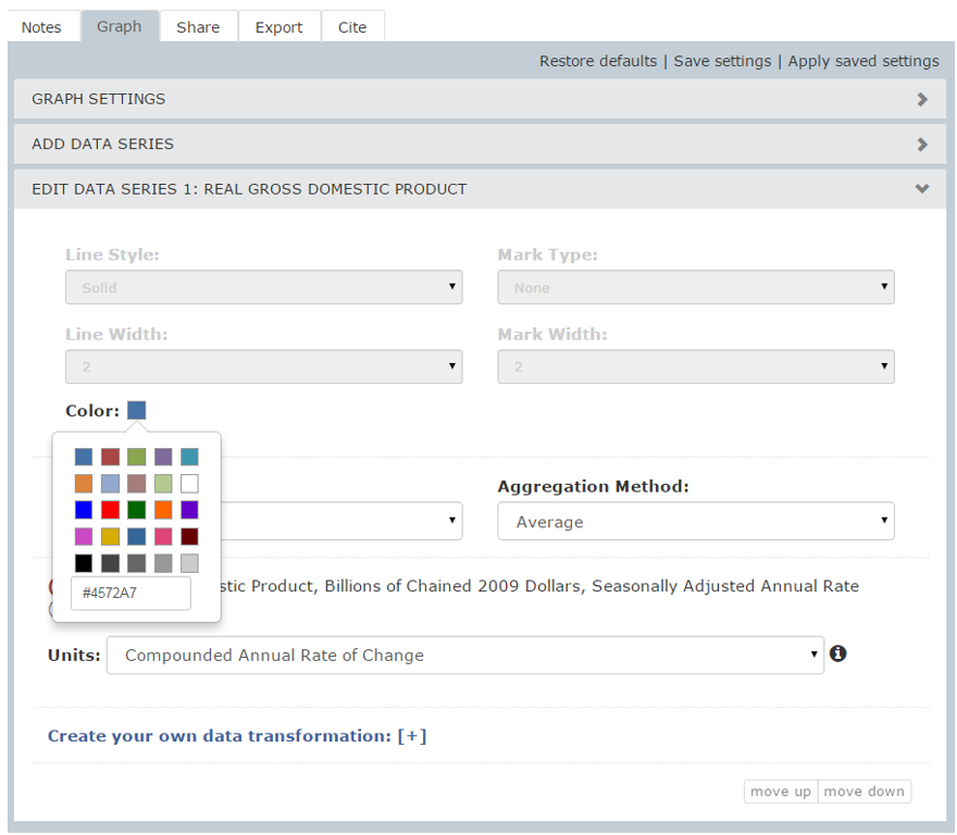
Once again, FRED auto-updates.
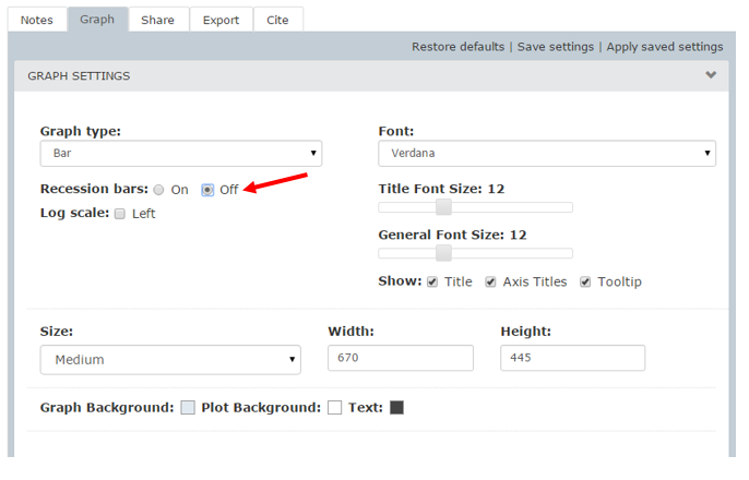
8. Turn Off Recession Bars
The shaded gray area covering late 2007 through 2009 indicates the most recent recession as determined by the National Bureau of Economic Research. This shading is often referred to as a recession bar. In this case, the shading aligns with a contraction in real GDP growth. Recession bars may be turned off. In the “Graph” tab, click on “GRAPH SETTINGS.” Next to “Recession bars, click the “Off” button.
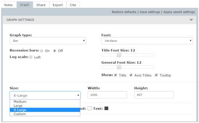
9. Enlarge the Graph by Choosing a Size: “X-Large” under Graph Settings
FRED’s attractive and informative custom graphs are perfect for reports, presentations, and web pages. Precise sizing is easy.
- Click on and drag the lower-right corner of the graph until the graph is the size you desire.
- To create an extra-large (1050 × 697 pixels) version of this graph, in the “Graph” tab under “GRAPH SETTINGS,” click the “Size” drop-down menu and select “X-Large.” The graph automatically resizes.
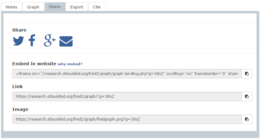
10. Share FRED Graphs
FRED offers a variety of ways to share graphs, including through email, social media, and embedding on your blog. To share a graph, click the “Share” tab (next to the “Graph” tab) and select among the options.