
In this newsletter, we use a graph to highlight the differences between CPI and core CPI inflation; explain how to interpret FREDcast forecasting error; map disinflation, inflation, and hyperinflation; and quiz you on inflation rates across different categories of goods and services.
How do CPI and core CPI inflation change with business cycles?
This assignment provides instructions on building the graph below and provides suggested writing prompts for out-of-class assignments.
Understand CPI inflation by forecasting it
By now, you have hopefully heard about FREDcast, the free, interactive forecasting game in which your students make forecasts for four economic releases: GDP, inflation, employment, and unemployment. Forecasts must be submitted by the 20th of the current month. As the data are realized, league and student results are automatically updated. Higher scores reflect greater accuracy over time. You can set up forecasting leagues for your classes. This short video explains how to create a league. The full instructions and FAQs are available here.
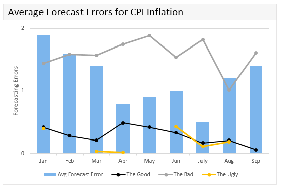
Below is an example, to show how each student in a league can see her forecasting error. In this fictional example, we’ve combined three students onto one graph. The blue bars represent the average forecasting error for the league (e.g., your class!). Each line represents the forecasting error for a different student. Notice that the yellow line is missing values because the student didn’t forecast for that month.
Help your students become better CPI inflation forecasters by diving into the data. Here are resources to get you started.
Explore a world of disinflation, inflation, and hyperinflation!
This assignment provides instructions on creating the map above and provides suggested prompts for in-class discussion.
Quiz yourself on inflation, including the CPI
Consider the graph of the consumer price index (CPI) for the following 4 item categories:
- Educational books and supplies
- Tuition, other school fees, and childcare
- Cable and satellite television and radio service
- Admission to movies, theaters, and concerts
Note that all indexes have December 2007, the start of the 2007-2009 recession, as the base period.
Q1: Since December 2007, which price item category has recorded the most inflation?
Q2. Since December 2007, which price item category has recorded the least inflation?
Q3. Since December 2007, which price item category has recorded the most inflation: goods and services associated with education or services associated with leisure?
Consider these two graphs of CPI—all items and all items less food and energy—since June 2009, the end of the Great Recession.
Q1: Which CPI is more volatile? CPIAUCSL (all items) or CPILFESL (all items less food and energy)
Q2: Between July 2014 and January 2015, what drove the decrease in the CPIAUCSL (all items)?
Consider the graph of the difference between the CPI (all items) inflation rate and the CPI (all items less food and energy) inflation rate.
Note that the inflation rates are calculated as monthly percentage changes from a year ago.
Q1: What does the difference between the CPI (all items) inflation rate and the CPI (all items less food and energy) inflation rate represent?
Q2: When was the food and energy inflation rate the highest? Why?
Q3: When was the food and energy inflation rate the lowest—even negative? Why?

Now that you’ve aced this quiz, give it to your students using this dashboard. To customize this dashboard, just click the “Save to My Account” button at the top of the dashboard.