
In this newsletter, we graph the unemployment rate and the natural rate of unemployment, use a U.S. state map to differentiate between unemployment rates and levels, show an actual example of FREDcast forecasting error, and quiz you on the unemployment rate across population categories.
Are we there yet? Reaching full employment.
This assignment provides instructions on building the graph below and provides suggested writing prompts for out-of-class assignments.
Using maps to differentiate rates from levels.
This assignment provides instructions on creating the unemployment maps below and suggests prompts for in-class discussion. See how you do on our discussion questions below.
Click on the map above to be taken to an interactive version. Name four states with unemployment levels above 400,000 persons.
Click on the map above to be taken to an interactive version. Name three states, in addition to the District of Columbia, registering the highest unemployment rates.
Briefly explain why the answers to the two previous questions are different. Explain why the news outlets report unemployment figures in rates instead of in levels.
Teach economics with FREDcast, the forecasting game the whole class can play!
By now, you have hopefully heard about FREDcast, the free, interactive forecasting game in which your students make forecasts for four economic releases: GDP, inflation, employment, and unemployment. Forecasts must be submitted by the 20th of the current month. As the data are realized, league and student results are automatically updated. Higher scores reflect greater accuracy over time. You can set up forecasting leagues for your classes. This short video explains how to create a league. The full instructions and FAQs are available here.
Below is an example of how each student in a league can see her forecasting error. In this actual example you can see how the player beat the overall average for every month but one. The black dot sitting far above the blue bar in month 16 reflects a forecast that was much more erroneous than the typical unemployment forecast for that month. The player reverted to form in the following months, however.

Help your students become better civilian unemployment forecasters by diving into the data. Here are the resources to get you started.
Quiz yourself on the unemployment rate by population categories
| Q1: Between January 1948 and June 1980, whose unemployment rate was most frequently higher: men’s or women’s? |  |
| Q2: Between December 1983 and today, whose unemployment rate was most frequently higher: men’s or women’s? |
| Q1: Rank the levels of educational attainment from lowest to highest unemployment rate. |  |
| Q2: What type of correlation between the level of educational attainment and the likelihood of being unemployed can you observe in the data? |
| Q1: Rank the racial or ethnic origins groups from lowest to highest unemployment rate. | 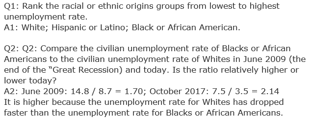 |
| Q2: Compare the civilian unemployment rate of Blacks or African Americans to the civilian unemployment rate of Whites in June 2009 (the end of the “Great Recession) and today. Is the ratio relatively higher or lower today? |
Now that you’ve aced this quiz, give it to your students using this dashboard. To customize this dashboard, just click the “Save to My Account” button at the top of the dashboard.