FRED had added 263 new series from Indeed Hiring Lab’s job posting tracker data repository. The added series are job postings by occupation, such as nursing or management, for the following countries: Australia, Canada, France, Germany, the United Kingdom, and the United States.
Indeed calculates the percentage change in seasonally adjusted job postings since February 1, 2020, using a 7-day trailing average. February 1, 2020, is the pre-pandemic baseline. Indeed seasonally adjusts each series based on historical patterns in 2017, 2018, and 2019. Each series, including the national trend, occupational sectors, and sub-national geographies, is seasonally adjusted separately.
Federal Reserve Economic Data
Announcements
FRED Expands Job Postings on Indeed
Posted in FRED Announcements
FRED Expands H.15 Selected Interest Rates
FRED has added over 100 new historical and active series from the Board of Governors’ H.15 Selected Interest Rates statistical release.
About two-thirds of the series added to FRED are historical series from the H.15 Statistical Release, including daily interest rates for Treasury bills, commercial paper, financial paper, and dealer offering rates, as well as weekly, monthly, and annual averages of H.15 historical series.
The active series added to FRED are annual averages of existing daily interest rate series, including market yields on U.S. Treasury securities, Treasury bills, commercial paper, and discount window primary credit rates. The active series added also include daily (business days) and biweekly frequency versions of the federal funds effective rate, as well as daily (7-day) bank prime loan rates and discount window primary credit rates.
Posted in FRED Announcements
FRED Maps Rise as GeoFRED Sets
As surely as the sun rises, FRED continues to provide great data tools. The latest is our new mapping feature. You can customize, share, and download geographical maps of data directly in FRED.
These maps are available for series in a dataset that have geographical characteristics, such as per capita personal income for U.S. states: For example, Missouri personal income can be examined on a U.S. state map.
Our GeoFRED website will close down Sept. 1, 2022, and we know a change like this can be disruptive, especially if you use GeoFRED as a teaching tool. So we hope our new FRED map feature will be a helpful alternative to engage with data.
Maps provide a cross-sectional perspective that lets you compare regions on a map while complementing and expanding the data analysis you get on a time-series graph. FRED has 9 types of maps: U.S. counties, U.S. metro areas, U.S. states, nations, Federal Reserve Districts, Census regions, Census divisions, BEA regions, and NECTAs (New England city and town areas).
Check out our FRED map tutorials for additional guidance on how to use this new feature and try it out to:
- Supplement your data story with an interactive map.
- Share your customized map with an option to automatically update the map with the latest data.
- Embed your maps in your favorite blog site.
- Download all data on the map into a single file.
Posted in FRED Announcements
FRED Expands G.19 Consumer Credit Release
FRED has expanded its coverage of the Federal Reserve Board’s G.19 Consumer Credit Release with an additional 36 monthly series.
These series cover Total and Revolving/Non-revolving Consumer Credit.
Posted in FRED Announcements
Chicago Fed Survey of Business Conditions Renamed
The Federal Reserve Bank of Chicago renamed the Chicago Fed Survey of Business Conditions (CFSBC) to the Chicago Fed Survey of Economic Conditions (CFSEC) to better represent the survey’s aim and base of respondents. This change is now reflected in FRED as well.
The goal of the survey remains unchanged: to assess the state of the economy in the Seventh Federal Reserve District, which is served by the Federal Reserve Bank of Chicago. The survey has always been filled out by both business and nonbusiness contacts.
For more details, see the CFSEC.
Posted in FRED Announcements
FRED Expands Commercial Paper with Historical Series
FRED has added 38 historical commercial paper (CP) series from before April 2006: On April 10, 2006, the Federal Reserve Board made major changes to its CP outstanding calculations. New outstanding categories were added, some existing category definitions were modified, and current and historical CP issuer information was updated. For more information, refer to the Commercial Paper Rates and Outstanding Summary.
CP consists of short-term, promissory notes issued primarily by corporations (up to 270 days in maturity but averaging about 30 days). CP is often used to raise cash for current transactions as a lower-cost alternative to bank loans.
Posted in FRED Announcements
FRED Expands Overnight AMERIBOR Unsecured Interest Rates with Derived Rates
FRED has added 2 additional series: the AMERIBOR® Term-30 and Term-90 derived interest rate indexes from the American Financial Exchange (AFX).
AMERIBOR® (American Interbank Offered Rate) is a transparent benchmark interest rate based on overnight unsecured loans transacted on the American Financial Exchange (AFX). The AMERIBOR® Term-30 and Term-90 indexes are designed to capture wholesale funding costs for American financial institutions over a 30-day and 90-day period, respectively, at a specific moment in time. These forward-looking short-term interest rates are calculated using a broad dataset of real-world primary issuances of wholesale commercial deposits and commercial paper of U.S.-domiciled financial institutions of every size. These indexes are also designed to be a transparent and representative short-term LIBOR alternative.
Posted in FRED Announcements
FRED Adds Overnight AMERIBOR Unsecured Interest Rates
FRED has added 9 new benchmark interest rates: the Unsecured Overnight AMERIBOR® Interest Rate, AMERIBOR® Term Structure Interest Rates, and the 30- and 90-day AMERIBOR® Overnight Average Rates from the American Financial Exchange (AFX).
AMERIBOR® (American Interbank Offered Rate) is a transparent benchmark interest rate based on overnight unsecured loans transacted on the American Financial Exchange (AFX). The arbitrage-free AMERIBOR® Term Structure of Interest Rates is derived from the Overnight Unsecured AMERIBOR® Interest Rate and the implied AMERIBOR® forward rates from the AMERIBOR® futures prices.
AMERIBOR® reflects the actual borrowing costs of thousands of small, medium, and regional banks across America. AMERIBOR® is also useful for larger banks and financial institutions that do business with these banks, as well as small and middle-market companies.
Posted in FRED Announcements
FRED Adds Selected Business and Consumer Loans Data
FRED has added 30 new series to the G.20 Finance Companies release from the Board of Governors of the Federal Reserve System. Most of these series are aggregates of current FRED series, combining owned and securitized data. For example, the two series in the graph above combine leases owned and leases securitized into the aggregate series of leases owned and securitized for both consumer motor vehicle loans and business motor vehicle loans.
Posted in FRED Announcements
Teaching About the COVID-19 Recession | Bring FRED into the Classroom | March 2022
Focus on Consumer Spending
This Page One Economics essay describes several changes in consumer spending related to the COVID-19-induced recession.
Focus on the Fed’s Response
This Page One Economics essay describes the use of monetary policy to support the flow of credit to households and businesses.
Storytelling with Data and FRED Interactive Modules

The COVID-19 Recession: Learn how to use FRED® to visualize the impact of the COVID-19-induced recession on gross domestic product. The FRED Interactive modules can be embedded in your learning management system.
Quiz Yourself on the COVID-19-induced Recession
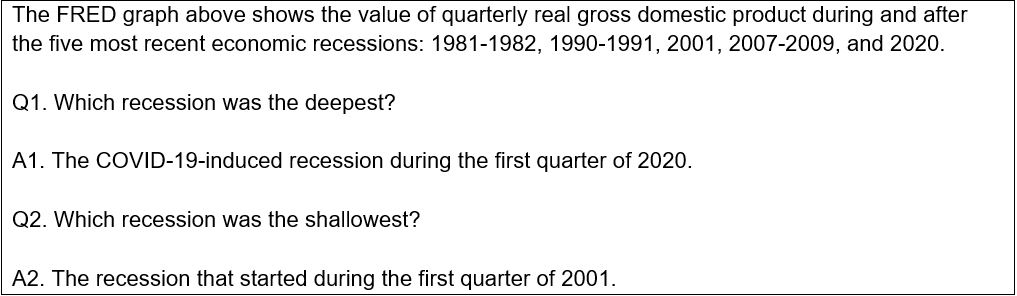
The FRED graph above shows the value of quarterly real gross domestic product during and after the five most recent economic recessions: 1981-1982, 1990-1991, 2001, 2007-2009, and 2020.
Q1. Which recession was the deepest?
Q2. Which recession was the shallowest?
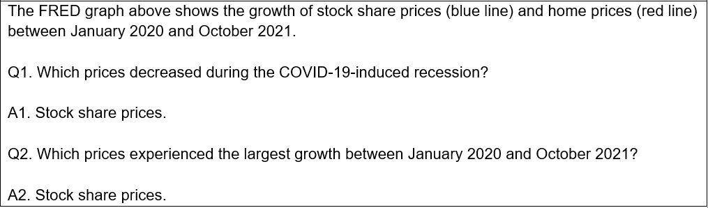
The FRED graph above shows the growth of stock share prices (blue line) and home prices (red line) between January 2020 and October 2021.
Q1. Which prices decreased during the COVID-19-induced recession?
Q2. Which prices experienced the largest growth between January 2020 and October 2021?
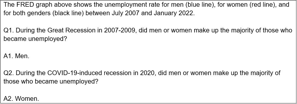
The FRED graph above shows the unemployment rate for men (blue line), for women (red line), and for both genders (black line) between July 2007 and January 2022.
Q1. During the Great Recession in 2007-2009, did men or women make up the majority of those who became unemployed?
Q2. During the COVID-19-induced recession in 2020, did men or women make up the majority of those who became unemployed ?
You can share these graphs with your students using this dashboard. To customize this dashboard, just click the “Save to My Account” button at the top of the dashboard.
Posted in FRED Classroom Newsletter