The second release, U.S. Granted Patents by States, Territories, and Countries, has U.S. granted patents originating in U.S. states/territories and foreign countries from 1992 to 2019. Patents granted are also broken down by patent type: utility, plant, design, and reissue patents.
These 53 series represent the changes that the FDIC implemented after redefining the “national rate” as follows: the average of rates paid by all insured depository institutions and credit unions for which data are available, with rates weighted by each institution’s share of domestic deposits.
On December 15, 2020, the FDIC Board of Directors approved a final rule making certain revisions to the interest rate restrictions applicable to less-than-well-capitalized institutions (as defined in Section 38 of the Federal Deposit Insurance Act), which are effective on April 1, 2021. The interest rate restrictions generally limit a less-than-well-capitalized institution from soliciting deposits by offering rates that significantly exceed rates in its prevailing market.
Users are encouraged to read the previously mentioned documentation, as well as view the release tables.
We’re pleased to announce that FRED is celebrating 30 years as a trusted leader in providing economic data! And archival FRED (ALFRED) is celebrating 15 years of storing real-time vintages of FRED data!
The invitation list for this celebration includes you, of course, and 788,000 of our closest friends. (That is, our data series.) Additional “guests” will trickle in over time.
We’re marking this milestone with an update to the FRED website header, which includes FRED-specific content such as Release Calendar, FRED Blog, and About FRED. It also gives credit to our parent, the St. Louis Fed’s Research Division, and sibling websites, all under the heading Economic Research Resources.
Notice the new trending search terms on the FRED homepage? This list of the most-looked-for data in FRED is updated twice per day to provide you with the most relevant and timely data info.
We’re happy we can continue to enhance these data services and provide valuable resources for your data needs. Help us celebrate by testing out these new features and let us know if you have any birthday data wishes.
Focus on Employment in Data Processing, Hosting, and Related Services
This assignment provides instructions on building the graph below and includes writing prompts for out-of-class assignments.
Using GeoFRED® to Compare Internet Use Across Countries
This assignment provides instructions on creating the map below and suggests prompts for in-class discussion. See how you do on our sample discussion question below.
Click on the map above to view an interactive version. Question: Name three countries where fewer than 20 of every 100 persons have access to the internet.
Learning About the Economics of Information to Forecast Changes in Gross Domestic Product
In the fourth quarter of 2020, real gross domestic product increased. Read on for more details and a list of resources to become a better FREDcast forecaster.
Quiz Yourself on Different Aspects of the Economics of Information
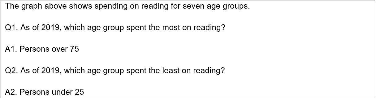
The graph above shows spending on reading for seven age groups.
Q1. As of 2019, which age group spent the most on reading?
Q2. As of 2019, which age group spent the least on reading?
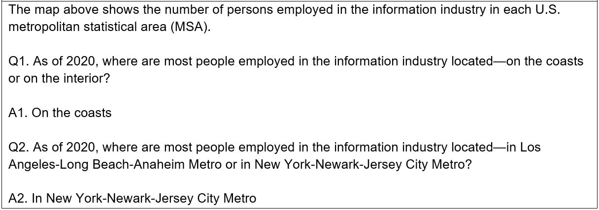
The map above shows the number of persons employed in the information industry in each U.S. metropolitan statistical area (MSA).
Q1. As of 2020, where are most people employed in the information industry located—on the coasts or on the interior?
Q2. As of 2020, where are most people employed in the information industry located—in Los Angeles-Long Beach-Anaheim Metro or in New York-Newark-Jersey City Metro?
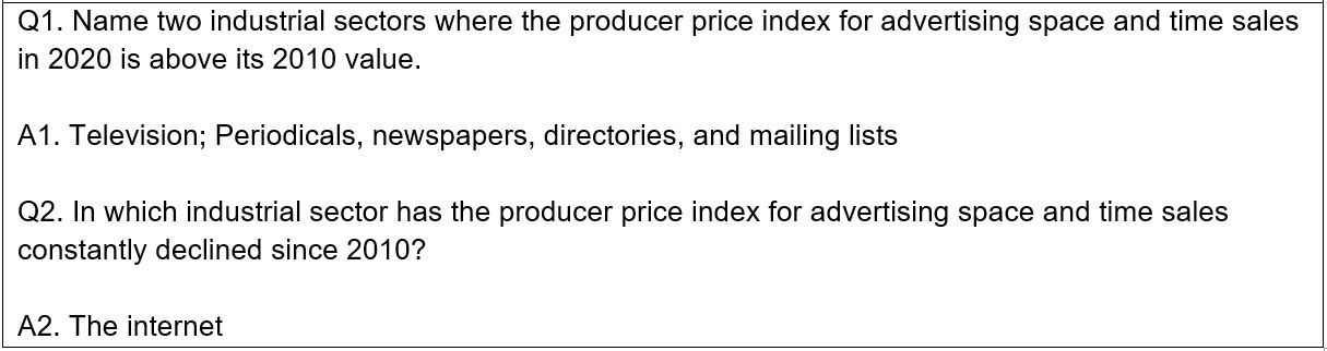
Q1. Name two industrial sectors where the producer price index for advertising space and time sales in 2020 is above its 2010 value.
Q2. In which industrial sector has the producer price index for advertising space and time sales constantly declined since 2010?
Now that you’ve aced this quiz, give it to your students using this dashboard. To customize this dashboard, just click the “Save to My Account” button at the top of the dashboard.
FRED has added 153 series from the Federal Deposit Insurance Corporation’s Quarterly Banking Profile (QBP). The QBP provides the earliest comprehensive summary of financial results for all FDIC-insured institutions. These series provide quarterly aggregate U.S. data since 1984.
Also, the Reports of Condition and Income for All Insured U.S. Commercial Banks release will be discontinued. Similar aggregate U.S. data can be found in the QBP release. Links to series similar to the discontinued ones are provided in the series notes where available. Raw data to reconstruct the other regional-based series are available from the Federal Financial Institutions Examination Council (FFIEC) Central Data Repository’s Public Data Distribution.
Focus on the Nominal and the Real Value of the Minimum Wage
This assignment provides instructions on building the graph below and includes writing prompts for out-of-class assignments.
Using GeoFRED® to Compare Minimum Wages Across States
This assignment provides instructions on creating the map below and suggests prompts for in-class discussion. See how you do on our sample discussion question below.
Click on the map above to view an interactive version. Question: Name three states where the minimum wage was above $10 an hour in 2020. Be sure to look at all 50 states.
Learning About the Minimum Wage to Forecast Changes in Employment
In January 2021, nonfarm payroll employment changed little. Read on for more details and a list of resources to become a better FREDcast forecaster.
BLS Headline:
According to the Bureau of Labor Statistics, “In January 2021…nonfarm payroll employment changed little.”
Quiz Yourself on the Economics of the Minimum Wage
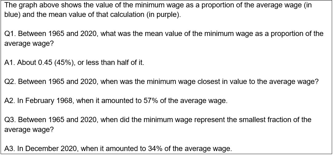
The graph above shows the value of the minimum wage as a proportion of the average wage (in blue) and the mean value of that calculation (in purple).
Q1. Between 1965 and 2020, what was the mean value of the minimum wage as a proportion of the average wage?
Q2. Between 1965 and 2020, when was the minimum wage closest in value to the average wage?
Q3. Between 1965 and 2020, when did the minimum wage represent the smallest fraction of the average wage?
The graph above shows the value of the minimum wage periodically revised by Congress (in blue), and its 1984 value had it been indexed to the consumer price index at that time (in purple).
Q1. As of December 2020, which one is higher?
Q2. Between 1984 and 2020, was the minimum wage set by Congress ever higher than the hypothetical inflation-indexed 1984 minimum wage?
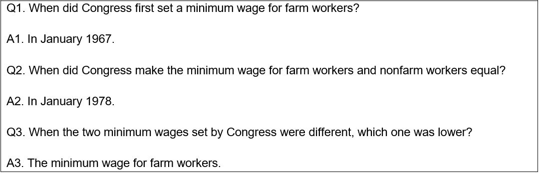
Q1. When did Congress first set a minimum wage for farm workers?
Q2. When did Congress make the minimum wage for farm workers and nonfarm workers equal?
Q3. When the two minimum wages set by Congress were different, which one was lower?
Now that you’ve aced this quiz, give it to your students using this dashboard. To customize this dashboard, just click the “Save to My Account” button at the top of the dashboard.
These four series are an extension of the Secured Overnight Financing Rate (SOFR). The SOFR averages are compounded averages of the SOFR over rolling 30-, 90-, and 180-calendar-day periods. The SOFR Index measures the cumulative impact of compounding the SOFR on a unit of investment over time, with the initial value set to 1 on April 2, 2018 (i.e., the first value date of the SOFR). The SOFR Index value reflects the effect of compounding the SOFR each business day and allows the calculation of compounded SOFR averages over custom time periods.
Users can view a daily snapshot of these data with the release tables.
The Board of Governors has made several changes to the H.6 statistical release, “Money Stock Measures,” to reflect changes announced on December 17, 2020.
As of February 23, 2021, the H.6 statistical release is published at a monthly frequency, on the fourth Tuesday of the month. In addition, the following changes have been made:
Savings deposits are now recognized as a type of transaction account, reflecting the Board’s action on April 24, 2020, to remove the regulatory distinction between transaction accounts and savings deposits. Therefore, the items “Savings deposits” and “Other checkable deposits” are now combined into “Other liquid deposits” in the M1 monetary aggregate. This action increases the M1 monetary aggregate significantly while leaving the M2 monetary aggregate unchanged.
The press release now contains only monthly average data needed to construct the monetary aggregates, thereby eliminating the release of data on institutional money funds and memorandum items on U.S. government deposits and deposits due to foreign banks and foreign official institutions. Components of the monetary aggregates will continue to be reported at a total industry level without a breakdown by banks and thrifts.
Weekly average, non-seasonally adjusted data will continue to be made available, while weekly average, seasonally adjusted data will no longer be provided.
In addition, due to the discontinuance of institutional money funds series, the Federal Reserve Bank of St. Louis is no longer able to calculate Money Zero Maturity (MZM) Money Stock, so these series and the Real MZM Stock (MZMREAL) have been discontinued in FRED as well. Users interested in calculating MZM can obtain institutional money funds data from the Investment Company Institute (ICI).
FRED has expanded job posting data from Indeed. The release now features trends in job postings for France and several new metro areas in the U.S.
Indeed has discontinued wage-tier posting data, and these data will no longer be updated on FRED. Indeed has also modified their release methodology significantly.
These data are copyrighted and require pre-approval: Contact Indeed to request permission to use the data.